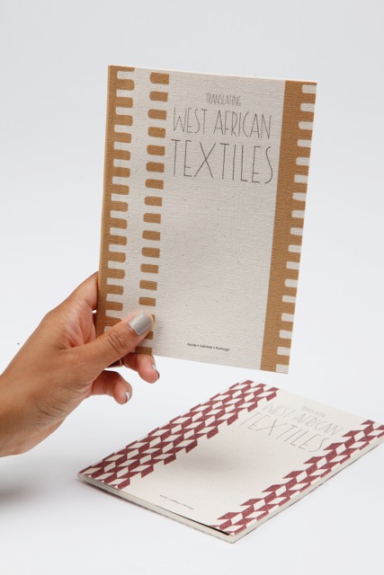
Translating West African Textiles: An Interview with Abi Wright
By Tommy Evans
Abi Wright is a UK-based textile, graphic and surface designer and curator whose work has been heavily influenced by her culture and identity, in particular exploring the symbolism of Kente cloth. Tommy Evans linked Abi to discuss her new book: Translating West African Textiles, and the experiences in Burkino Faso that have shaped much of her work.
Without seeking to impose limitations via labelling, could one describe your artistic output as “Afropean”?
The term ‘Afropean’ definitely reflects the narrative of my most recent projects – finding a way to unite and celebrate my identity and surroundings visually has been an enlightening but hard journey, but I’m so glad I have carved out this space for myself. I will always use my work as a means of communicating everything that I stand for.
Your textile work is heavily influenced by West African materials and iconography. What prompted that initial interest and how do you apply your own unique “variation on a theme” whilst giving the “empty appropriation” (to quote your good self!) of pastiche a pass?
I love African textiles because of the beautiful colours and the patterns, but what keeps me intrigued is the history, the hidden language and rich cultural associations that are literally woven into each castillos hinchables piece. Did you know a family’s legacy, surnames, and proverbs are woven into each section of a Kente cloth? The detail is exquisite. The depth is often overlooked. Visual communication was and still is an important part of our history – in the same essence of the talking drum – with each warp and weft a word or sentence is transcribed – very much a secret language, and this is beautiful to me.
What prompted my research into this area was the disconnection between the heritage and the aesthetics of these textiles when appropriated for commercial consumption. I wanted to create a timeless celebration of West African textiles and the multi-layered qualities they contain, and this is how my book ‘Translating West African Textiles’ came to fruition.
I researched the early methods of textile production including strip cloth and Indigo dying, eventually exploring the development of Kente cloth, Adinkra symbols, Korhogo motifs, and the importance of colour and their symbolism. The art of textile design is a historical masterpiece with so many different chapters and subheadings to delve into, so I decided to focus on a digestible amount of information while working on my book.
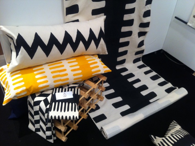
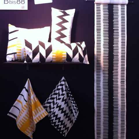
After a short hiatus away from this project I began to experiment with surface design and textiles again as I had the urge to develop the project further, but I knew I needed to keep these beautiful patterns in their original form. My style developed through the research and dissection of each layer found within a traditional Kente cloth. For example, Kente cloths are made up of up to three patterns and three or four colours which are used to create a repetitive pattern. Each pattern has its own meaning associated with life, love, family or relationships and every colour symbolises an emotion or natural element – when combined they essentially create a story but once separated, they become singular yet [just as] powerful emblems of West African heritage.
This simple yet extremely bold statement excites me each and every time, and has since become my design mantra: ‘deconstruction’ – “to deconstruct is to re-build an understanding”.
“Sustainability” is a recurrent theme in your work and comes across as less slogan, more core value, anchoring your whole methodology. How do you marry ethics with aesthetics?
Sustainability is definitely a factor I am conscious and considerate of when designing now, thanks to an eye-opening gap year at university and a work-based trip to Burkina Faso, but in all honesty it isn’t something I overthink.
I have a genuine passion for preserving and highlighting culture and identity, and I guess sustainability is a natural factor, especially when working alongside such talented and resourceful crafts men and women in Burkina Faso.
As a corollary to the above, you’ve connected and collaborated with creatives in Burkina Faso employing traditional techniques. How was the journey, in both the geographic and graphics sense of the term?
SOS-SaveOurSkills is a company with its sole purpose rooted in preserving and maintaining natural resources and craftsmanship in countries that are often exploited or undervalued. SOS-SaveOurSkills later created AA-AA, AfriqueAuthentique-AuthenticAfrica – a cotton farming based project that proves that the skills and materials cultivated in Burkina Faso can be created by hand and from scratch ethically, marketed and sold at a price that is in line with their value.
As a graphic designer and creative director I was put to task to update AA-AA’s original logo. My objective was to create a modernised and memorable identity as the original logo was a little out of date and didn’t communicate the desired direction of the brand effectively. I achieved this by using a simplistic, bold font and simplified the name of the company with a memorable and easy acronym.
The design process was a challenge, as I had to be careful not to completely disregard or delete significant cultural signifiers that were already communicating the company’s ethos. Luckily, I gained incredible inspiration from the gorgeous textile collections that are made for the company’s traditional and modern motifs.
I exhibited alongside AA-AA and master weaver Massan Pelembe during the London Design Festival in London and at the International Contemporary Furniture Fair in New York. I was lucky enough to be invited to visit their facilities in Ouagadougou, Burkina Faso, where I was taken on a historical craft journey. I visited cotton harvesting plots, natural dye and Indigo farms, and where the elders (men) of the villages use traditional looms to weave lengths of hand-spun cotton – every aspect of this artistic journey was completely new to me, and it gave me a whole new understanding of the concept of being sustainable, resourceful, and a highly skilled craft-maker. It was also an experience that is completely priceless, educative, and something I wish many more could experience. I now appreciate colour – or lack of – so much more, as well as time and the idea that a masterpiece cannot be rushed or duplicated, plus working ethically. This is where this factor became embedded into my design process.
My trip to BF was geographically breathtaking. And enlightening. I was extremely inspired by how tactile and hands-on “they” are, as opposed to how dependent on modern technology “we” can be – it definitely encouraged me to revert back to being more creative away from the safety net of my laptop. As for the scenery, my sketchbook is filled with patterns that I saw on fences, doorframes, shop fronts, artisan markets and local parks. It did wonders for the creative side of my brain, but left me questioning so much of “our” daily routines that are second nature to “us”. We really do take a lot for granted and are constantly rushing! And that’s another thing. Time. I definitely had the luxury of time while in Ouaga.
I conducted an impromptu and somewhat amateurish investigation into the stories behind the names of your pieces in the Achimota : Unity collection. Correct me if I’m wrong (and I suspect I am), but Achimota is a town in Ghana whilst Achi Baba is located in Gallipoli, Turkey. So what’s the legend behind “Woross : Achi” and “Nkyi : Woross”?
Achimota (now nicknamed Motown) is a boarding school named after its home, Achimota in Accra, Ghana. To commemorate the opening of this educational premises in 1927, a motto and logo were created to reflect the progressive actions and thinking of this small town. The logo, an image of the black and white keys of a piano are supported by the motto “Ut Omnes Unum Sint” meaning “That all may be one”, a reference that the founders agreed on in context of one’s experience upon entry to education – black and white, male and female, all should be integrated and equal. The keys of the piano represent the difference between playing them separately or playing them together creating a harmony.
Achimota : Unity is a collection that reflects the symbolism attached to the West African symbol ‘Achimota Nsfoa’, deriving from the above logo, so the attached symbolisms (unity – in diversity – harmony, and knowledge) remained the inspiration while I experimented with the combination of two or three patterns while developing my collection of textiles and products. Each product inherited the patterns’ name or part of it, to honour this collaboration of prints.
Segueing from Africa to America: you’ve showcased your work at the ICFF (International Contemporary Furniture Fair); please expand upon that Big Apple vibe and your experiences visiting and exhibiting there.

I exhibited a small selection of textiles as part of a special feature installation at the ICFF in 2013, along with the textiles of AA-AA and a demonstration from Burkinabe master weaver Massan Delembe. My work was received really well, especially on the occasion I engaged with visitors to my booth – they loved hearing about the importance of such a craft and the depth of culture that is woven or printed within each piece of fabric. This encouraged me to develop my collection further, resulting in a range of interior furnishings that I launched officially at the ICFF in 2014.
Representing my own brand was a pretty great experience as the ICFF is one of the largest trade shows in the world. It was a little overwhelming to begin with, but the excitement of setting up, meeting other designers and networking abroad soon took away the subtle undercurrent of nerves. The UKTI also do a great job of making the participants feel at home – it’s also very comforting to hear visitors are already aware of my work and look forward to seeing my brand develop.
New York is also amazing for inspiration – the appreciation for culture and art is incredible so it’s always a pleasure to visit. I’d also love to exhibit in an art capacity, or collaborate on a project that would allow me to create graphics for an amazing event or show.
Transitioning once again, this time from NYC to the Caribbean: your “Madras” collection flaunts a very different appearance to Achimota. Do elaborate…
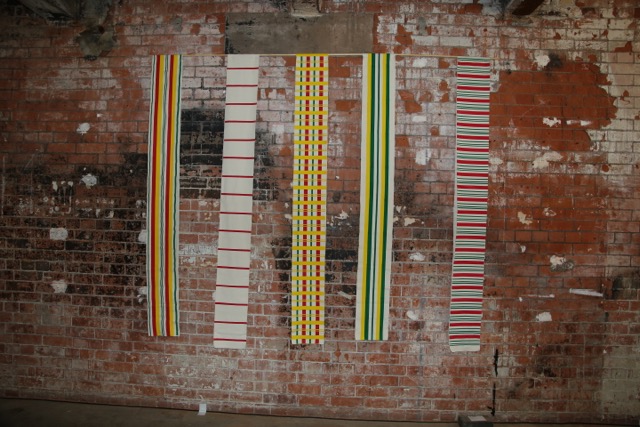
Madras is very different aesthetically to Achimota : Unity – this time I injected some colour and printed only vertical and horizontal lines, but similar to Achimota : Unity in terms of design approach. Madras textiles are made up from roughly three layers of warp and weft stripes in red, green, and yellow. The stripes create different hues of colours due to the overlapping, and a chequered design. I dissected each layer to create a much more simplified version to emphasise the detail and to act as a catalyst for another research project that I’m yet to develop.
Madras was a short project based on the Madras textiles now associated with the Caribbean that I was inspired to create whilst in Burkina Faso working on A:U. I’m always at my peak of creativity when I’m travelling so I try to make the most of the bursts while I experience them.
You’ve explored important ideas and issues pertaining to identity and belonging via typography and photography. Can we expect to see these undercurrents informing your (subtly thought-provoking) textile work in a more overt manner or do you consider them two different domains?
I created a photographic / moving image / textile based installation at the African and African-Caribbean Design Diaspora (AACDD) Festival in 2013, although this was an experimentation I was excited by the crossover of mediums. This was also later part of my installation Achimota : Unity – adding different formats of documentation and culture to the concept of unification.
Typography, photography and textiles are very different outlets of expression, but I love the idea of crossing boundaries. I’d also love to combine music and moving image to the mix too… Watch this space.
Continuing the socially conscious thread: not only are you a creator and curator but an educator. What positives do you personally extract from mentoring and how do you employ your gifts to empower others?
I had the amazing opportunity to mentor a group of 15-16 year olds aboard the London Eye for the first official WOW (Women of the World): International Day of the Girl festival, in collaboration with the South Bank Centre and Plan UK. The invite was initially crazy to me as I was among some pretty spectacular women, ranging from sports personalities to actresses and world-renowned artists. I would hope that my odd pearl of wisdom, however small, came in handy to the handful of amazingly talented and eager young women that I spoke to, as I know how daunting it can often feel as a creative person with so many uncertainties and not enough encouragement within the creative curriculum and prospective career pool.
My objective when in a scenario of this kind is to be as open and honest as possible and that is to make it clear that working independently (as an artist or designer) is one of the hardest and most challenging things I have ever experienced – the only thing harder than that is attempting to ignore that passion.
I’ve also had the opportunity to teach a Key Stage 2 class about West African textiles and patterns, and that was an adorable experience, and made me love what I do even more. I had a love/hate relationship during the later years of my fine art education (I later moved into graphic art for this reason), I may have enjoyed it more if the techniques we were taught were a little more culturally inclusive so I am happy that I was able to inject a tiny bit of culture into this early stage art class. I highlighted the importance and beauty found within this area of culture, and the powerful significance that the colour black holds. The class of children then produced their own West African inspired patterns. It was beautiful – one of my highlights of that year.
To close the conversation, what are your future plans, projects and ambitions as an artist?
At the moment I am focused on developing Abi Wright Design, my graphic design based company. So far AWD can be broken down into two sectors – client based work and my personal work, steadily growing my expertise within creative direction, consultancy, event management, and exhibition curation, within the former.
Aside from wanting to create beautifully designed graphics for companies, start-ups and other business orientated folk, I’m eager to continue my evolution as an artist producing projects that I have had on the back burner for a while. I am currently re-working my second instalment of This Is Me, a photographic project documenting the individual experience of those that identify with the term ‘mixed race’. The project will be the basis of an archive, documenting a range of experiences by people of all ages and heritages.
I will continue challenging myself and those that interact with my projects, making sure my work is progressive and as reflective as possible. This means taking more risks and allowing myself to make more mistakes whilst learning from them.
Working solo can often feel like an uphill battle with little room to stop and breathe so I’ve decided to be more appreciative of my achievements along the way. Managing the (often extreme) highs and lows and the success and failures of this career type is a task in itself so I now use the term “Planning The Next Peak” (advised to me by a very dear old friend of mine) to keep my eye on my next goal.